Client: Pfizer
Brand: VYNDAQEL®
As VYNDAQEL continued to strengthen its position as the leading treatment for ATTR-CM, one asset remained at the center of its visual identity: the V-Heart. Originally designed to communicate trust, stability, and longevity, the symbol had become a recognizable expression of the brand's leadership. As the global platform evolved around the Built for the Future campaign, the challenge became not to reinvent the
V-Heart, but to refine it—giving every element a clearer purpose while creating a more cohesive,
future-forward symbol capable of carrying the brand into its next chapter.
V-Heart, but to refine it—giving every element a clearer purpose while creating a more cohesive,
future-forward symbol capable of carrying the brand into its next chapter.
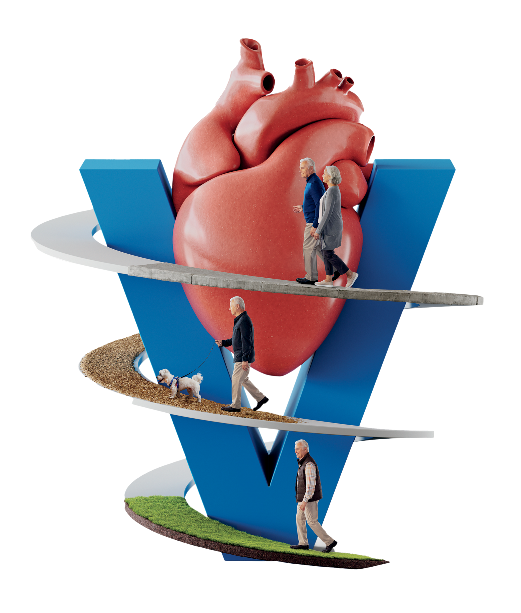
Something OLD
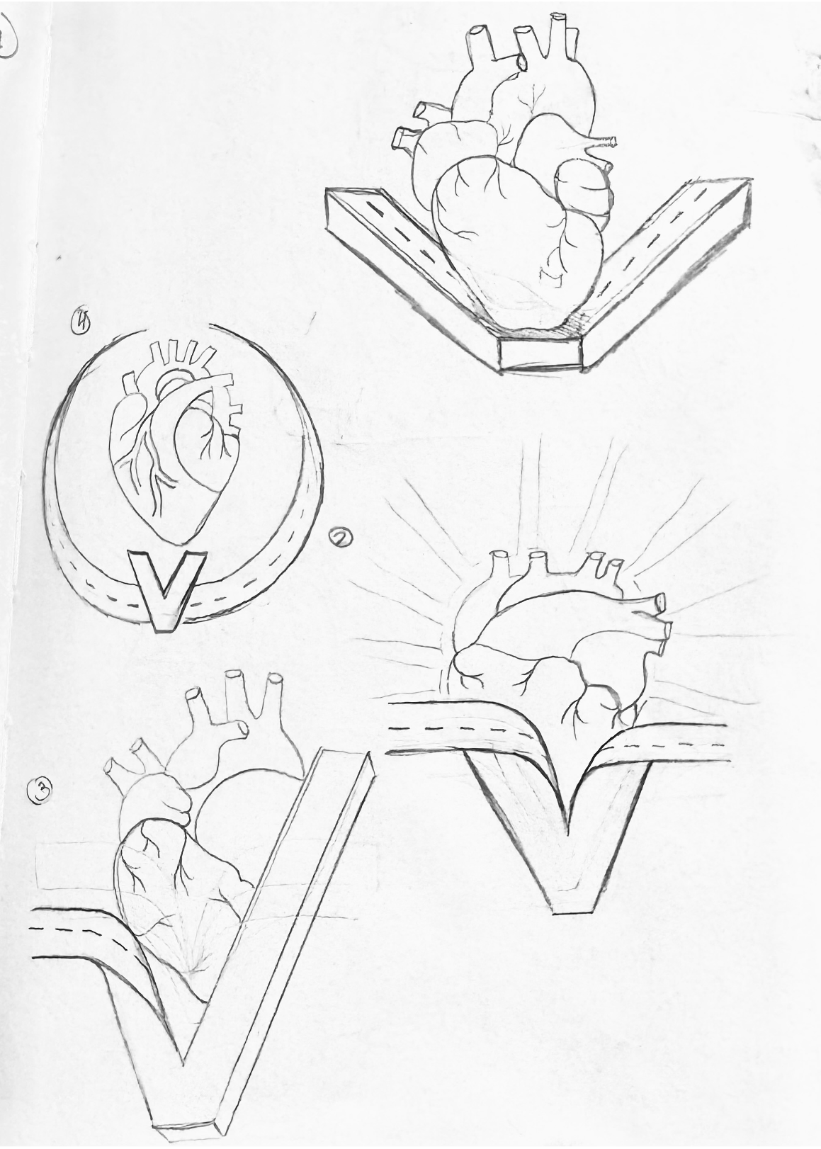
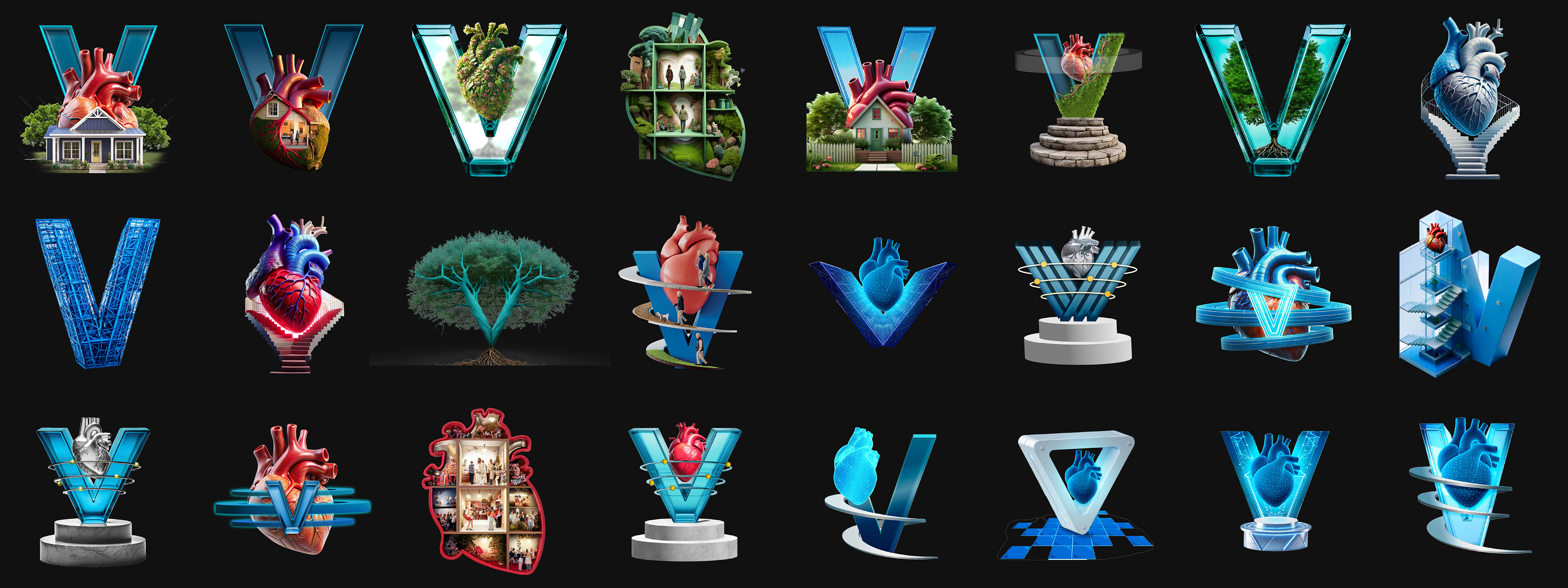
The V-Heart had become a recognizable symbol of Vyndaqel's leadership in ATTR-CM, but its next chapter required a greater sense of purpose. As the centerpiece of the Built for the Future campaign, the symbol needed to do more than represent the brand—it needed to embody the longevity, stability, and confidence that have defined Vyndaqel's role in care. Before exploring what was next, we first identified the elements worth preserving: the trusted anatomical heart, the enduring path, and the V itself—the anchor that held everything together.
The V-Heart had become a recognizable symbol of Vyndaqel's leadership in ATTR-CM, but its next chapter required a greater sense of purpose. As the centerpiece of the Built for the Future campaign, the symbol needed to do more than represent the brand—it needed to embody the longevity, stability, and confidence that have defined Vyndaqel's role in care. Before exploring what was next, we first identified the elements worth preserving: the trusted anatomical heart, the enduring path, and the V itself—the anchor that held everything together.
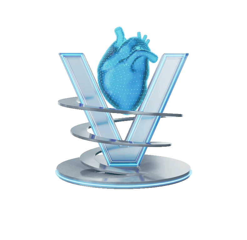
Something NEW
The challenge wasn't reinvention—it was evolution.
As Vyndaqel entered a new era and Pfizer Brand 2.0 emerged as the foundation of the broader visual system, the V-Heart needed to feel more intentional, contemporary, and future-forward. The goal was to create a symbol capable of carrying the Built for the Future narrative while remaining instantly recognizable to the audiences who already trusted it.
Something BORROWED
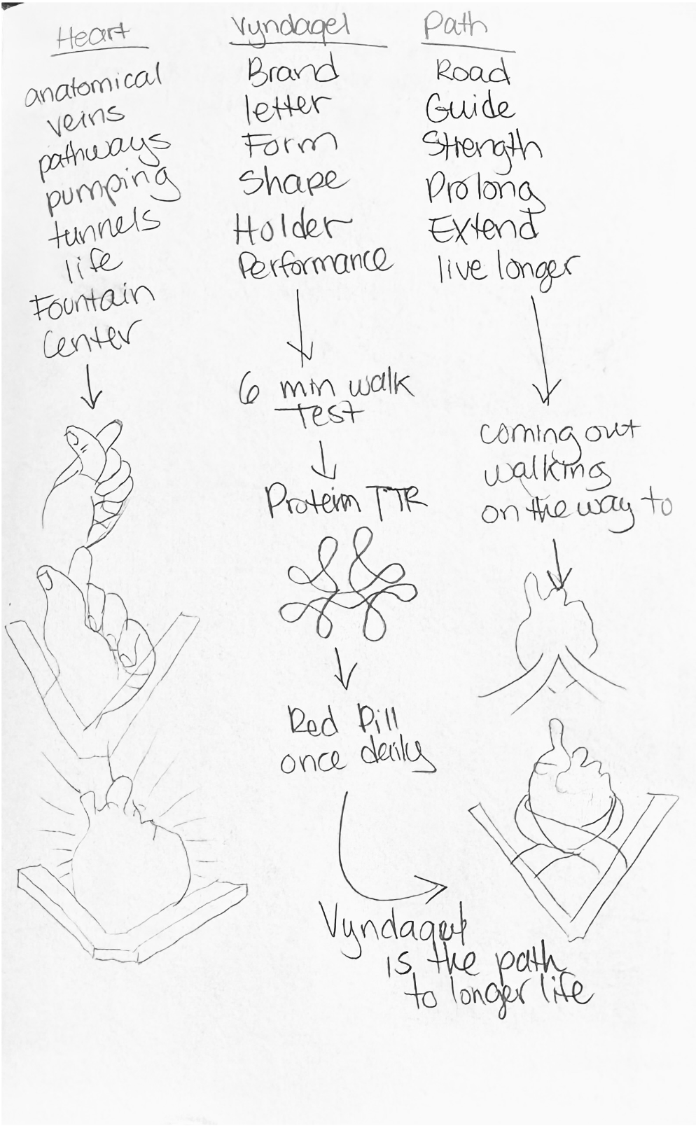
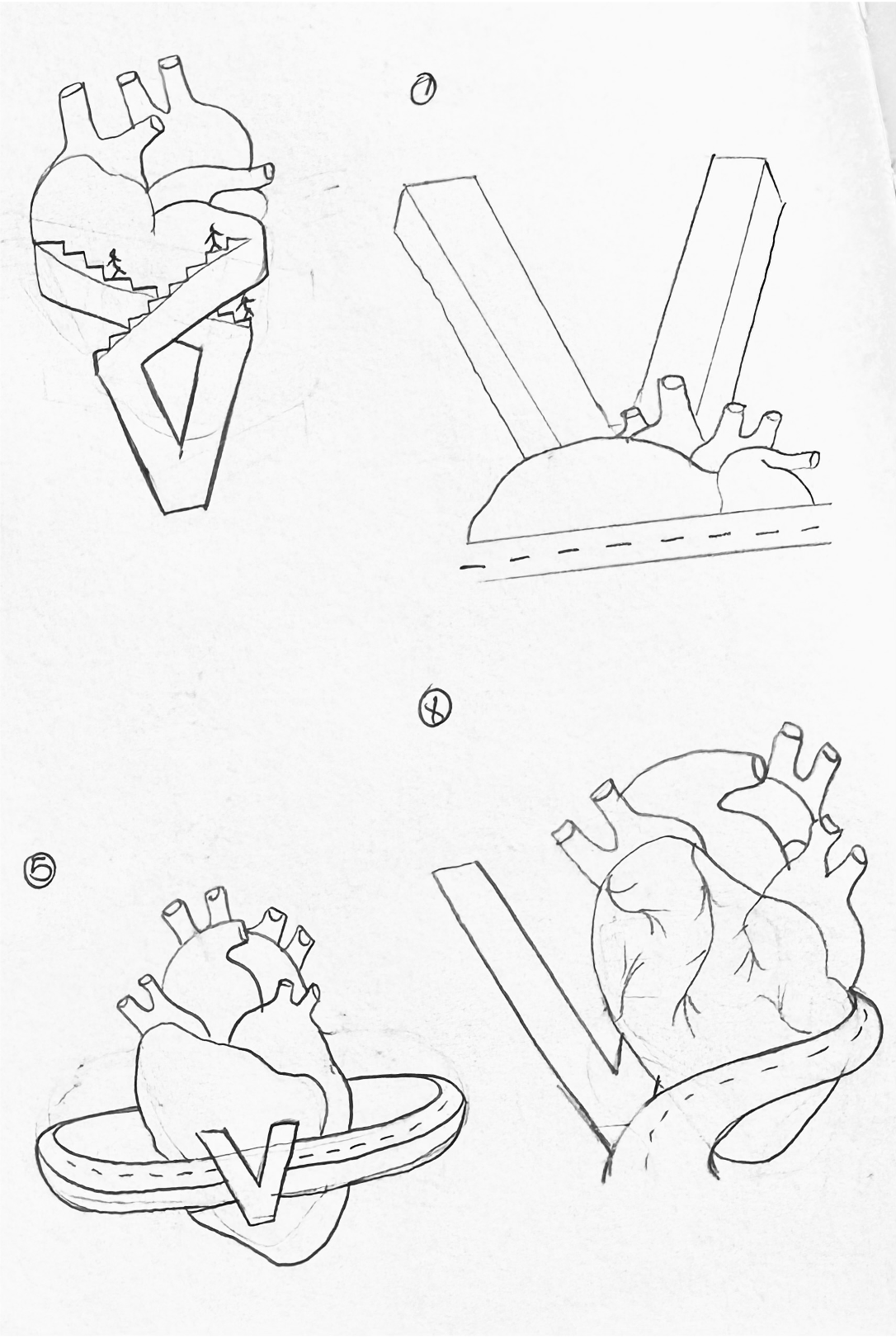
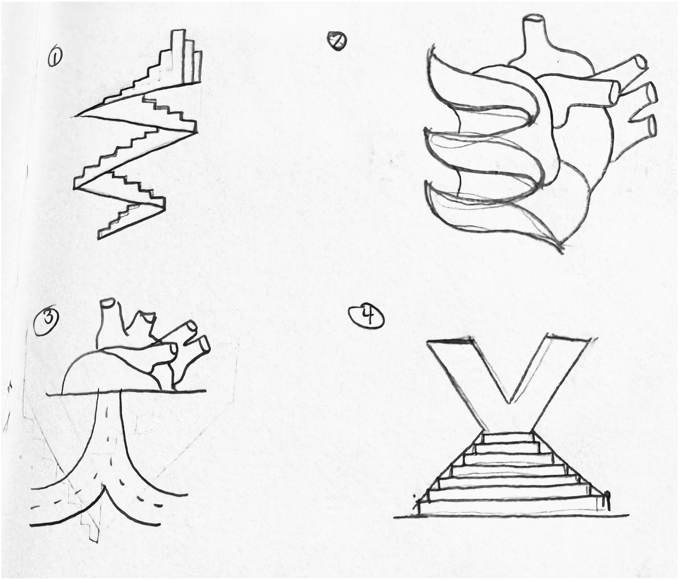
The strongest ideas came from outside the category. We looked beyond healthcare and borrowed from systems associated with progress, longevity, and resilience—from monumental architecture and emerging technologies to the universal idea of home. These explorations became the foundation for three distinct territories—Built for the Future, Level Up, and Vital Roots—each offering a different interpretation of what it means to be built to last.


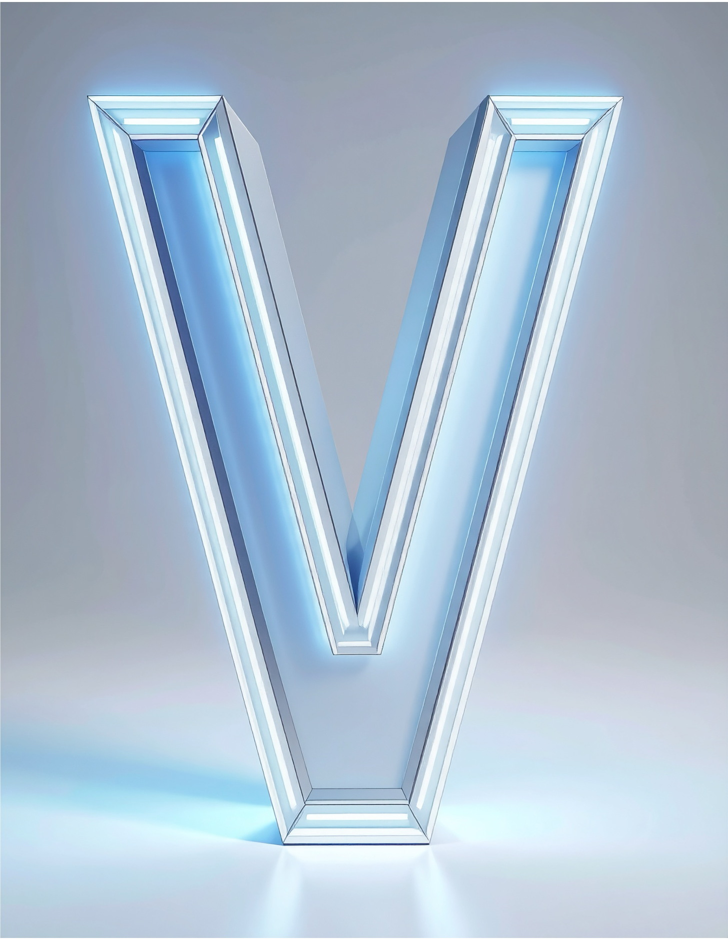
Something BLUE
The final V-Heart became a balance of preservation and progress. It retained the recognizable structure that audiences already trusted while introducing a more dimensional, future-forward expression aligned with Pfizer's evolving design language. More than a symbol, it became a visual representation of Vyndaqel's commitment to carrying decades of proven experience into the future of ATTR-CM care.